Braier: A Distinctive Display Font for Digital Branding
As a UI designer who ships dozens of landing pages, SaaS dashboards, and e-commerce experiences each year, I don’t reach for display fonts lightly. They need to earn their place—not just look interesting in a specimen sheet. Braier is one of those rare display fonts that delivers both personality and precision. It’s not ornamental for ornament’s sake; it’s engineered to anchor attention, reinforce tone, and elevate digital hierarchy without sacrificing clarity.
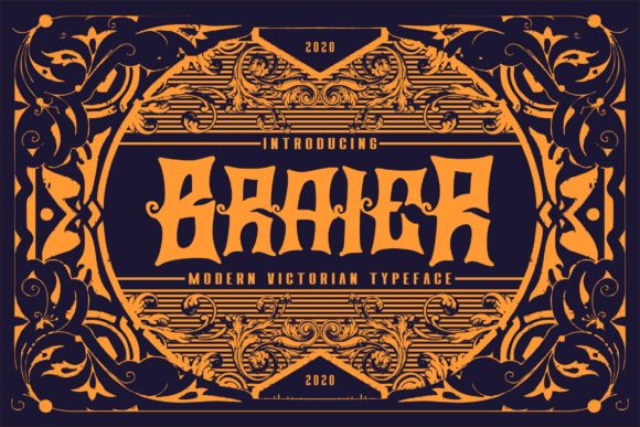
Visually, Braier balances confident geometry with subtle humanist warmth. Its letterforms feature clean, slightly tapered terminals, open counters, and consistent stroke contrast—giving it presence at large sizes while retaining legibility even when scaled down to 36px on high-DPI screens. It’s neither strictly geometric nor calligraphic; instead, it occupies a thoughtful middle ground—modern enough for a tech startup, expressive enough for a creative studio, refined enough for a luxury boutique. That versatility makes Braier especially valuable in responsive web design, where one font must perform across hero banners, mobile navigation labels, and product cards.
In practice, I use Braier most effectively where visual weight and brand voice converge: hero section headlines, primary CTA buttons, section dividers, and branded content headers. On a coaching website, pairing Braier with a neutral sans serif like Inter or Manrope instantly signals authority and approachability—Braier carries the emotional weight, while the body type handles readability and scanning efficiency. For an online store selling handmade ceramics, Braier works beautifully over muted image overlays: its strong x-height and generous spacing ensure text remains crisp against textured backgrounds, even at 50% opacity.
Readability isn’t automatic—it’s intentional. Braier shines in short-form contexts: headlines under 8 words, button labels (“Get Started”, “Join the Studio”, “Explore Collection”), and micro-copy like testimonial attributions or feature tags. Avoid using it for paragraphs, form inputs, or navigation menus. On mobile, I limit Braier to H1s and prominent CTAs above the fold—always testing line height (1.2–1.3x) and letter-spacing (+0.5–1px) to prevent crowding on smaller viewports. With dark mode enabled, I apply a subtle text shadow or increase contrast by 10–15% to maintain definition against deep backgrounds.
Font pairing is where Braier reveals its strategic value. Because it’s a display font—not a workhorse—it thrives alongside highly legible, low-contrast companions. My go-to pairings include:
- Sans serif pairings: Inter, Poppins, or Work Sans for digital products and SaaS interfaces—clean, accessible, and well-hinted for web rendering.
- Serif pairings: Cormorant Garamond or Literata for editorial sites, course platforms, or brand storytelling—adding gravitas without competing visually.
- Monospace accents: Recursive or IBM Plex Mono for code snippets, pricing tables, or technical differentiators—creating deliberate typographic contrast.
Always verify what’s included before licensing. Braier ships with standard OpenType features—including stylistic alternates and ligatures—that add nuance to headlines without manual tweaking. It supports Latin-based languages out of the box and renders reliably as a WOFF2 webfont. Check whether variable font support is available; if so, you gain fine-grained control over weight and width directly in CSS—ideal for responsive headline scaling.
For conversion-focused layouts, Braier helps guide the eye with rhythm and intention. On a course sales page, I’ll set the main headline in Braier at 4rem, then drop to a lighter weight for the subhead—creating clear visual stepping stones toward the enrollment CTA. In a portfolio site, Braier anchors project titles while descriptive text stays in a modest sans serif, ensuring users absorb context before diving into case studies. Even in email headers or social media ad creatives exported from Figma, Braier maintains impact at thumbnail size—its distinctive ‘a’, ‘g’, and ‘R’ act as quiet brand signatures.
Brand consistency starts with typography—and Braier supports that continuity across touchpoints. Use it in your Figma design system as the sole display typeface, then carry it into live HTML/CSS via @font-face declarations or a trusted font host. Apply it uniformly across your website, Notion brand hub, Canva social templates, and PDF pitch decks. When users see Braier on your homepage, your Instagram Story highlight, and your checkout confirmation, they’re not just seeing a font—they’re recognizing a voice.
Licensing matters—especially for commercial projects. Braier is a premium font, and its license covers web embedding, SaaS applications, client websites, digital templates, and online stores—as long as usage aligns with the tier you select. If you’re building a white-label dashboard or selling a Figma UI kit, confirm extended licensing terms upfront. Never assume desktop-only licenses cover live web deployment. A single webfont license typically permits unlimited domains under one brand—but always review the EULA before launch.
Ultimately, Braier isn’t about decoration. It’s about distinction with discipline. It gives your digital interface a recognizable pulse—without slowing it down. Whether you’re refining a fintech landing page, launching a creative agency site, or refreshing an e-commerce brand identity, Braier offers the kind of focused expressiveness that converts attention into trust, and trust into action.